I CAME BACK TO HEAPERS HANGOUT TO YELL ABOUT THE NEW GOOGLE LOGO

edited 2015-09-04 04:34:48 in General
REEEEEEEEEEEEEEEEEEEEEEEEEEEEEEEEEEEEEE
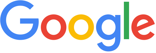
REEEEEEEEEEEEEEEEEEEEEEEEEEEEEEEEEEEEEEimage
Tagged:

Comments

  • I've learned to tolerate drama...except on the boat
    what about it?
  • SOILED IT
    SOILED IT
    SOILED IT
  • Touch the cow. Do it now.
    it's boring
  • I've learned to tolerate drama...except on the boat

    it's boring

    what do you think it should look like then
  • I've learned to tolerate drama...except on the boat
    Also I don't think geometric letters are boring >_>
  • Touch the cow. Do it now.
    Anonus said:

    it's boring

    what do you think it should look like then
    1. a ransom note
    2. an illegible black metal band logo
    3. tits
  • edited 2015-09-04 05:21:02
    Now that I'm slightly less mad, I feel that the "childlike" look combined with Google's desire to know everything about your life is vaguely patronizing. The circles kind of blend in to each other when viewed from a far distance, so it's not as readable as the old logo to me. I'm not convinced that it preserved the look of the previous logo, even though it kept the colors and the slanted E. Finally, the G looks a bit thin compared to the other letters.

    I think it's being called "boring" because "clean" and colorful sans-serif redesigns have been trendy for several years now.
  • Sup bitches, witches, Haters, and trolls.
    the new google logo is fine
  • TreTre
    edited 2015-09-04 05:03:56
    image
    It's weird; the critical consensus seems to be that it's fairly well-done as an evolution of the previous mark (with Steve Heller likening it to Paul Rand's work in an interview with The Verge, even) but my friends and the general public, if they bother to have an opinion on it at all, seem to find that it made the brand less distinctive by going with a sans serif over a serif.

    Always the devil's advocate, I'm on the "good evolution" side, myself; the old logo, while certainly charming in the way that things like it become after being integrated into the daily lives of millions, was a relic of the Google of old; they tried to modernize it as much as possible in its later years by shrinking the drop shadows and textures to the point of invisibility, but the arrival of Material Design and (to a lesser extent) iOS 8 kind of foreshadowed the fact that a larger change was going to occur, and I feel like they did a very good job of keeping the old mark's character while bringing it in line with the look and style of 2015 Google.

    (I'm also very excited to see how it'll be integrated into the Doodles.)
  • Sup bitches, witches, Haters, and trolls.
    yeah, also I think the new G fits in with the Holo style better (is it still called that?)
  • TreTre
    edited 2015-09-04 05:52:55
    image
    Since Android 5.0, the Holo name and look has been effectively replaced by Material Design, which ditches the Tron lines and dark theming that Holo embraced in favor of a brighter, more colorful approach.

    (Essentially, the whole OS is now based on the look established with Google Now and its cards, especially in regard to the way users interact with the visual prompts.)
  • Touch the cow. Do it now.
    it's boring
  • TreTre
    edited 2015-09-04 15:05:51
    image
    Perhaps, but no moreso than the old one was. 

    Armin from Brand New phrases it better than I can right now, being in class:
    Armin Vit said:

    This isn’t just a logo that needs to print on a business card, embroider on a polo, and work on a website — it has to do all those things plus live in smartphones, watches, TVs, tablets, eventually car dashboards, and who knows what else in the near future. A lot of visual solutions to a logo wouldn’t adapt well to this challenge, which is why the simplicity many people are reacting to as boring is the right approach.

  • imagei will watch the heck outta this pumpkin patch
    i think it looks decent enough, but i don't like the favicon
  • It doesn't matter because the end goal of all capitalist megacorporations is the same.

    :downer Jane noises:
  • imagei will watch the heck outta this pumpkin patch
    . . . to make money?
  • Sup bitches, witches, Haters, and trolls.
    Tachyon said:

    i think it looks decent enough, but i don't like the favicon

    I think the favicon changes are more jarring than the logo ones.
Sign In or Register to comment.