Those yellow "Store Closing" banners

edited 2012-06-26 01:17:08 in General
Seriously, is there, like, one manufacturer who prints those banners that every single failing store seems to use?

I mean, have a sampling from Flickr:

New Hope MN Kmart

Store Closing

Sign of the times

Sears Store Closing at Crestwood Plaza - Crestwood, MO_DSCN2898

Super Fresh Store Closing

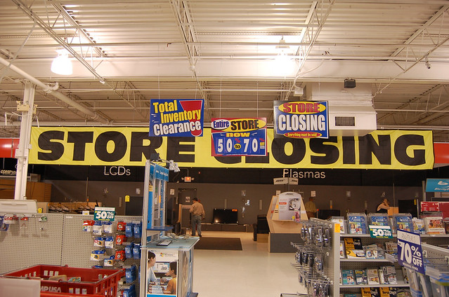
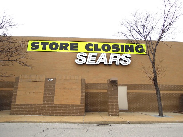
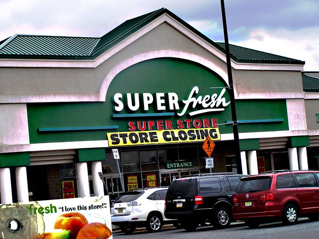
Sure, there are a few variations--this one, for instance, uses a different typeface--but it seems like most of them use that really thick weight of Antique Olive.

This always fascinated me. Why do they all look alike?
Tagged:

Comments

  • edited 2012-06-26 01:21:15
    I've learned to tolerate drama...except on the boat
    I'm not sure. Also it's name is Antique Olive Nord, silly.

    I admit it wasn't until recently that I stopped associating Antique Olive with chintziness; this perception of it as such battled with aesthetes' and designers' affection for the typeface, which seems to stem partly from its top-heavy weight distribution.
  • Probably for exactly that reason. How much competition could there possibly be in the area of "sells "Store Closing" signs"?
  • You are the end result of a “would you push the button” prompt where the prompt was “you have unlimited godlike powers but you appear to all and sundry to be an impetuous child” – Zero, 2022
    ^^ I couldn't tell if it was Nord compressed or Compact stretched, honestly, so I went with the noncommittal wording after staring at the MyFonts page entirely too long.

    ^ Well, I would think there would be...y'know, some? I mean, stores go out of business all the time, so it's not like a sign company couldn't make money that way...
  • I have to imagine it's one of those things that people don't think about too often, so no one ever tries to capitalize on it.

    Sans whoever started what I am now referring to as Store Closing Inc. of course.

    I might be wrong though, you could Google it if you want to know for sure.

  • edited 2012-06-26 02:22:16
    :|
    That would make a great bedroom decoration.
  • The sadness will last forever.
    lol same banner everywhere
  • edited 2012-06-26 12:14:56
    READ MY CROSS SHIPPING-FANFICTION, DAMMIT!

    i get so angry sometimes i just punch plankton --Klinotaxis
    imageimageimageimage

    Whatever company that manufactures those signs is making BANK!
  • I've learned to tolerate drama...except on the boat
    Oh, the typeface on those Blockbuster signs is Univers.
  • You are the end result of a “would you push the button” prompt where the prompt was “you have unlimited godlike powers but you appear to all and sundry to be an impetuous child” – Zero, 2022
    Univers seems to be the most common variation after the ubiquitous Antique Olive design, from what I can tell.
  • Doctor Who reference in Pokemon B2W2? Headcanon accepted.
    Anonus said:

    I'm not sure. Also it's name is Antique Olive Nord, silly.

    What font would recommend for my comic? Serious question here
  • I've learned to tolerate drama...except on the boat
    What context, speech bubbles?
  • Doctor Who reference in Pokemon B2W2? Headcanon accepted.
    yeah, for dialog
  • Doctor Who reference in Pokemon B2W2? Headcanon accepted.
    I've been meaning to ask this for a while, anyway. I've grabbed a few from blambot (free and pay) and I'm not too crazy about any of them
  • edited 2012-06-26 11:49:52
    I've learned to tolerate drama...except on the boat
    I'm not really into comic fonts, but one of the foundries I've perused, Canada Type, has a bunch of them; this seems like a decent one.
Sign In or Register to comment.